Project Timeline
This project was completed over an 8-week period, with each phase carefully planned to ensure comprehensive research, ideation, and design.
Research & Discovery
Stakeholder interviews, competitive analysis, and problem definition
User Personas and Rough UX Flows
Creating personas based on research and mapping current user journeys
Low Fidelity Prototypes and Alternatives
Sketching initial ideas and creating wireframes for testing
User Testing
Testing the LoFi prototypes with the Stakeholders and taking notes on their feedback.
High-Fidelity Prototyping
Creating detailed visual designs and interactive prototypes in Figma
User Testing & Iterations
Testing prototypes with users and refining based on feedback
Final Refinements & Delivery
Making final adjustments and preparing deliverables
Background
Large-scale management and organization systems play a crucial role in industries that handle complex operations and data management. In energy data analysis specifically, professionals often encounter inefficient workflows and unintuitive interfaces that make their tasks more challenging to navigate.
Our main stakeholder, who works at Calpine Energy Solution, uses a traditional Revenue Management (RM) system that allows data analysts to review customer records, maintain databases, and execute various analysis reports. However, the current system is outdated, difficult to navigate, and often freezes when handling large data sets.
Energy data analysts working with customer records struggle with complex, poorly documented systems that require extensive learning time, causing them to repeatedly miss analysis deadlines and experience growing anxiety about falling behind on multiple client deliverables.
Given the increasing volume of data and the growing reliance on technology for decision-making, improving the user experience of these systems became a necessity for our stakeholder. Our team was tasked with redesigning the interface to create a more intuitive, efficient, and error-free workflow for their data analysts.
User Research
Research Methods
We conducted interviews with two key stakeholders. Our goal was to understand the current software used for large-scale data management and the challenges that stakeholders face in their day-to-day operations.
Stakeholder Interviews
Data Analyst at Calpine Solutions
Daily Activities: Analyzes customer records, ensures accurate accounts setup, performs correlation analysis on billing and utility data, and follows up with utilities regarding billing inquiries for CCA customers.
Tools Used: Outlook, SQMD, CAISO Metering, Calpine Website Tool, Excel, SQL, Microsoft Teams, Revenue Manager (RM), SDGE & Utility Websites, Visual Cron
Pain Points: Outdated RM app that freezes when working with large datasets; confusing tab placement that switches positions; unintuitive toolbar functions; cannot access records when SCE fails to send updates overnight or when archive processes are paused
Purchasing Coordinator at Aerospace Company
Daily Activities: Manages procurement activities, negotiates contracts and rates for parts and labor, develops cost-saving strategies, and creates/manages purchase orders worth millions of dollars.
Tools Used: Outlook, Microsoft Excel for data analysis, PowerBI for visualizing trends, Microsoft Teams, and in-house ERP system for supply chain management
Pain Points: Challenges managing large amounts of data; difficulty transferring between different systems; time-consuming report generation in PowerBI and ERP; unintuitive user interfaces; lack of visual feedback for supplier compliance
Our semi-structured protocol included:
- Introduction: Introducing the goal of the study and obtaining consent to record/transcribe the interview.
- Background: Gathering information about their daily work and main tasks using specific software.
- Observation: Asking stakeholders to walk us through their typical tasks using the software to identify breakdowns and pain points in their workflow.
Key Findings
Our primary stakeholder is a Data Analyst for Calpine Energy Solution. Their responsibilities include:
- Analyzing customer records and ensuring accurate account setup
- Generating and reviewing exception reports to identify errors
- Performing correlation analysis on billing, utility, and customer service data
- Communicating with other departments to ensure proper functionality
Throughout their day, they use multiple software applications, but the two main ones are:
- Revenue Manager (RM): Used to access the revenue management application to ensure proper billing processes
- Calpine Webtool: An in-house tool for employees to access utility data and other resources
Pain Points
- The RM software is outdated and often freezes when working with large data volumes
- Tabs in the RM software tend to switch positions after the user changes tabs, causing confusion and errors
- The toolbar in RM is confusing as the functions are not clearly labeled or understood
- Access to records can be disrupted if background processes fail, leading to delays
- Searching for specific customer information is tedious, especially when using long account numbers
Personas
Primary Persona: Jack
Junior Data Analyst
Jack is a junior data analyst with a pre-med background who feels overwhelmed by setbacks and stuggles with the company's new interface, cuasing stress and delays.
- A user-friendly system with clear documentation.
- More confidence while handling unexpected issues.
- Improved efficiency with a better understanding of workflows.
- Better version control.
- Confusing and unintuitive software.
- Too many functions that are not self-explanatory.
- Extra hours spent learning how to use software.
- Cluttered workspace
Jaquline
Senior Data Analyst
Jaquline, a senior data analyst, with 20+ years of experience (15 in energy), excels in complex tasks but struggles with system delays that disrupt deadlines. These system delays are often due to accidental errors made by analysts due to the unintuitive workflow of the in-house software.
- Reliable system performance, especially during critical phases.
- Advanced tools for quick data manipulation and viualization.
- More customization within the dashboard to organize and prioritize tasks and tools.
- Delays that cause cascading effects on project timelines.
- Unintuitive task flows that waste time navigating through systems.
- Inconsistent data accessibility during peak work hours.
Competitive Audit
We conducted a competitive audit of similar data analysis tools to identify best practices and potential improvements for our redesign. We compared three major products in the energy data analysis space:
| Features | Tableau | EnergyCap | DNV |
|---|---|---|---|
| Web Based | Yes | Yes | Yes |
| Learning Curve | Highest | Lowest | Moderate |
| Data Visualization | Excellent | Standard | Limited |
| Real-Time Monitoring | Limited | Yes | Yes |
| Dashboard Customization | High | Moderate | Read Only |
| Large Datasets | Struggles | Handles Well | Handles Well |
| Collaboration | Yes | Yes (not live) | No |
Key Insights
- Tableau offers the most customizable and user-friendly interface, which should be a priority for our redesign
- EnergyCap's strengths are in its simplicity and ability to work with large datasets without slowing down. This shows the importance of optimizing layouts to ensure intuitiveness.
- DNV's ability to handle very large datasets is very popular. However, it has very low customizability and lacks visuals.
- Overall, Layout optimization is essential for ensuring intuitive navigation across all platforms
These insights guided our design decisions, helping us focus on creating an interface that combines the best aspects of these tools while addressing the specific needs of energy data analysts.
UX Flows
Based on our research and competitive analysis, we developed UX flows to map the user journey through the redesigned interface. We focused on the most common tasks performed by data analysts:
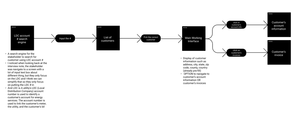
Key Flow Components:
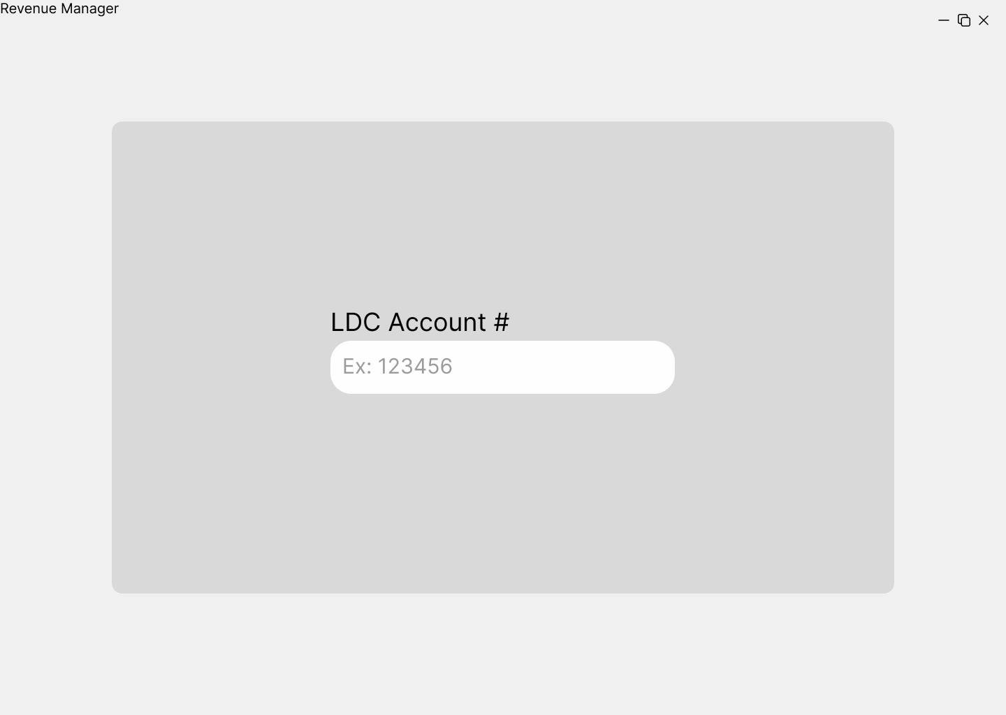
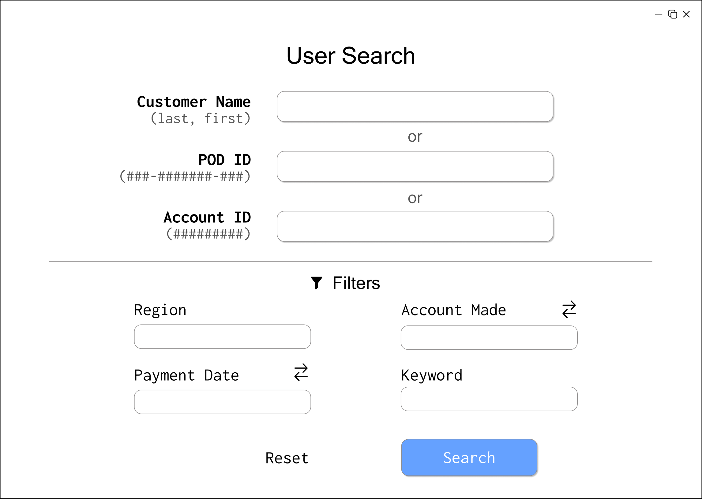
- Enter the LDC account number that the customer is under
- Search for and select a customer
- View customer information (city, state, zip, etc.)
- Access the customer's account information
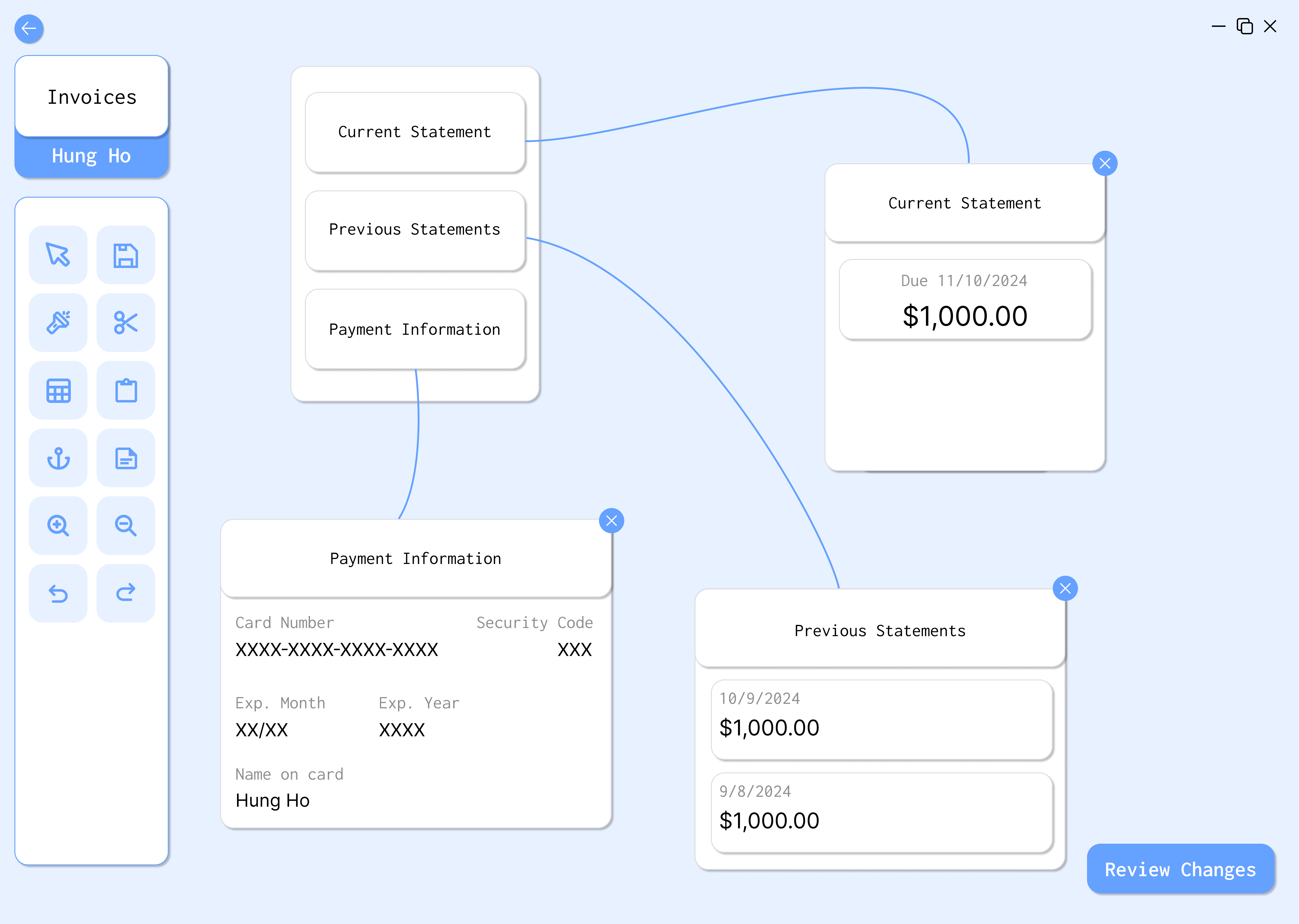
- View the customer's invoices
- Review and confirm any changes made
This flow addresses the main pain points identified in our research:
- Simplifies the search process with multiple entry points (account number, name, etc.)
- Provides a clear, logical progression through tasks
- Reduces the likelihood of tab-related confusion by creating a more intuitive workspace
- Allows for easy confirmation of changes to prevent errors
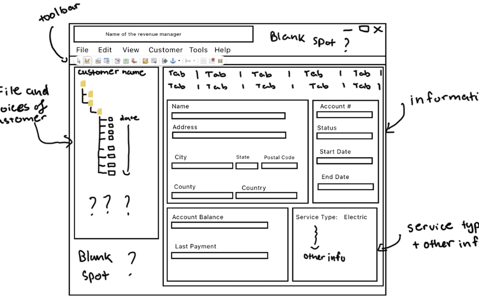
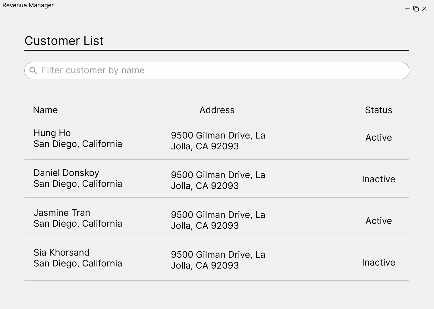
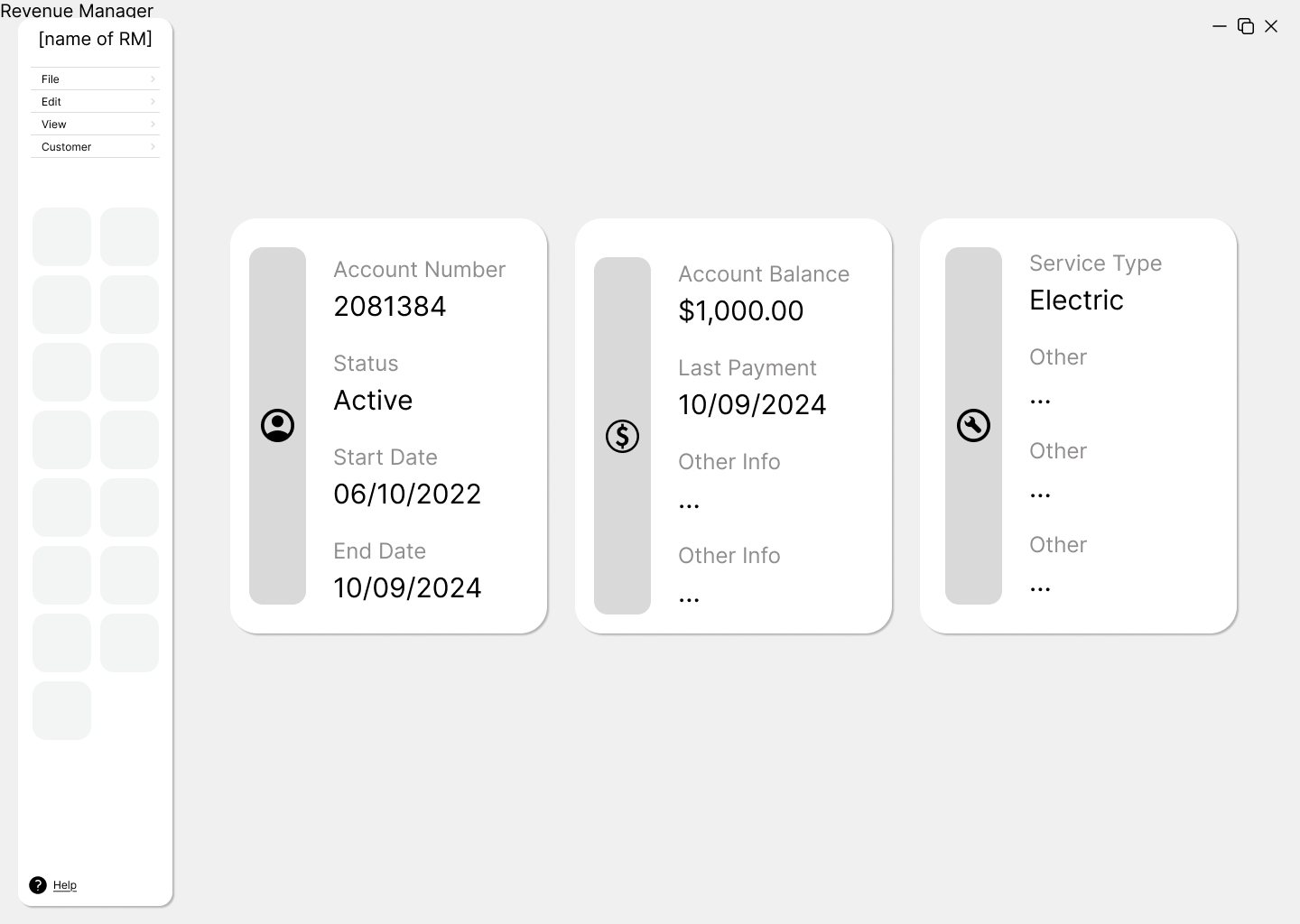
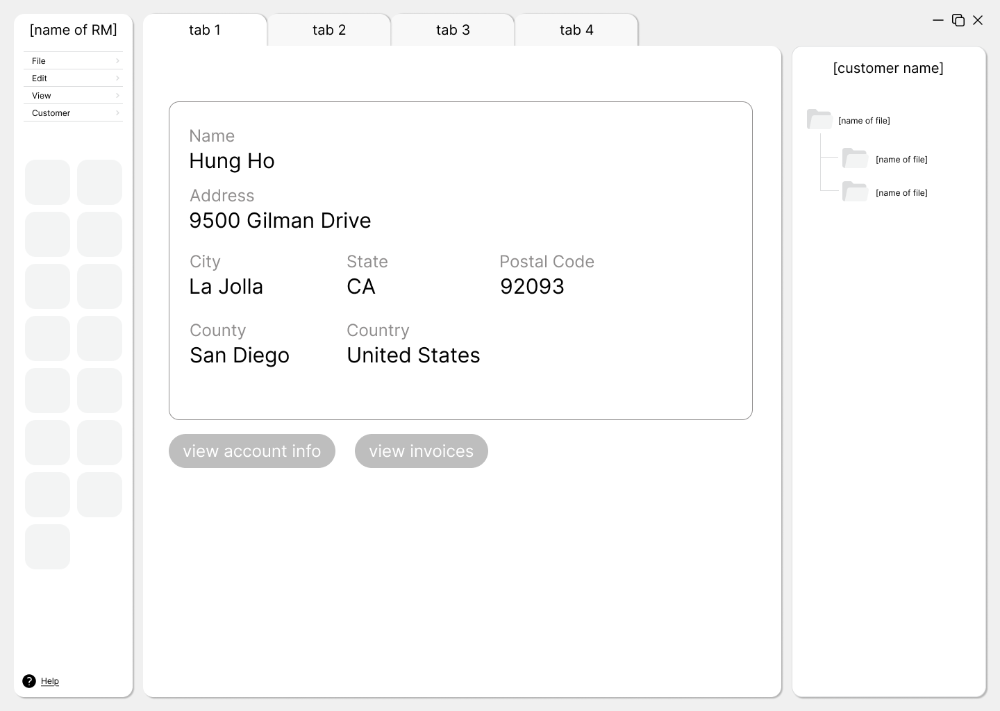
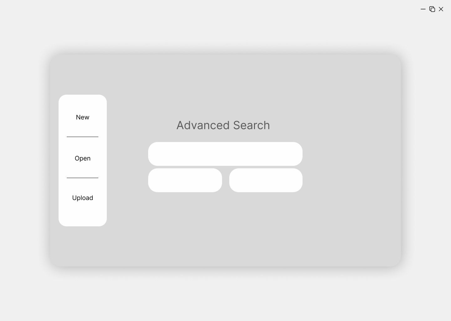
Low-Fidelity Prototype
We developed two distinct approaches for our low-fidelity wireframes:
Prototype 1: Tab-Based Interface
The first approach featured a simple, tab-based environment that focused on:
- Clear organization with tabs for different types of information
- An improved toolbar with illustrative icons and descriptions
- Dedicated workspaces for each type of task
Prototype 2: Node-Based Interface
The second approach took a more experimental direction with a node-based canvas that offered:
- Visual representation of connections between information
- More flexibility in workspace arrangement
- Dynamic, customizable working experience
- Better visualization of relationships between data points

We also explored a hybrid approach that combined elements from both designs, which later influenced our final direction.
Tools Used
For our low-fidelity prototypes, we used:
- Figma: Our primary tool for wireframing and collaboration
- Paper sketches: For initial ideation and rapid concept exploration
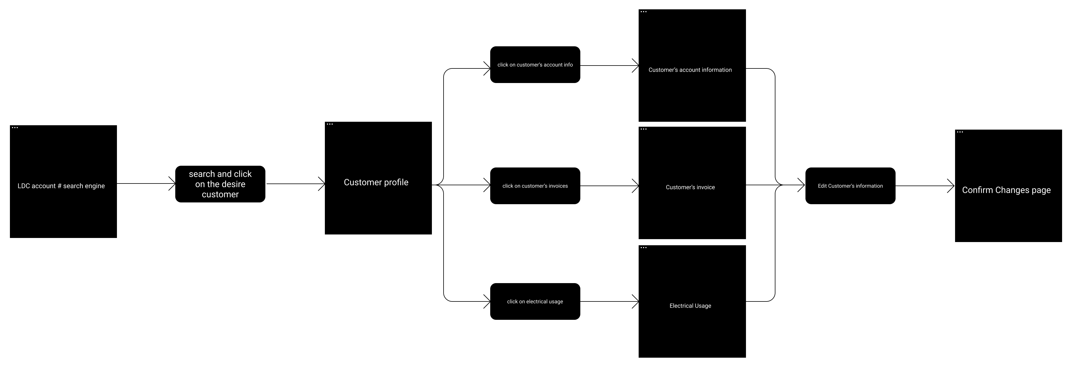
User Testing
Testing Method
We conducted user tests with our primary stakeholders to evaluate both prototypes. Participants were asked to complete the following tasks:
- Enter an LDC account number
- Search for and select a customer
- Find customer information (city, state, zip, etc.)
- View the customer's account information
- View the customer's invoices
Key Findings
The testing revealed a strong preference for Prototype 2 (node-based interface) with some elements from Prototype 1:
- Features users liked:
- The general information page layout from Prototype 1
- The overall design and node-based workspace of Prototype 2
- The larger, more visible toolbar from Prototype 1
- The advanced search function in Prototype 2, which allows searching by multiple criteria
- Suggested improvements:
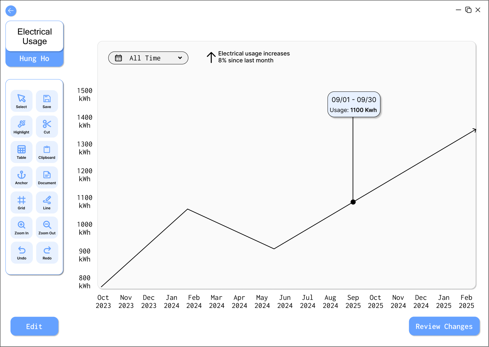
- Add a tab about electrical usage of customers from start to current date of account
- Include more visualization options for trends analysis
- Provide clearer differentiation of the node connections
Users emphasized that Prototype 2 provided a more customizable workspace that would help them organize information according to their specific needs, making their workflow more efficient.
Based on this feedback, we decided to focus on the node-based design while incorporating some elements from the tab-based approach, particularly the customer information layout that users found intuitive.
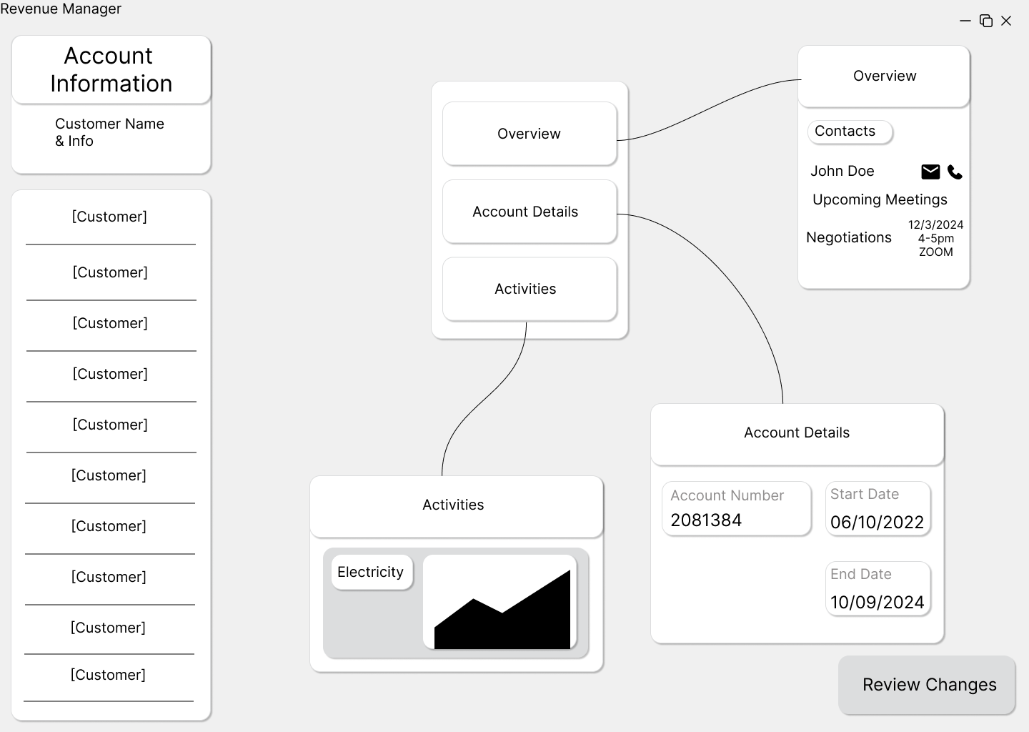
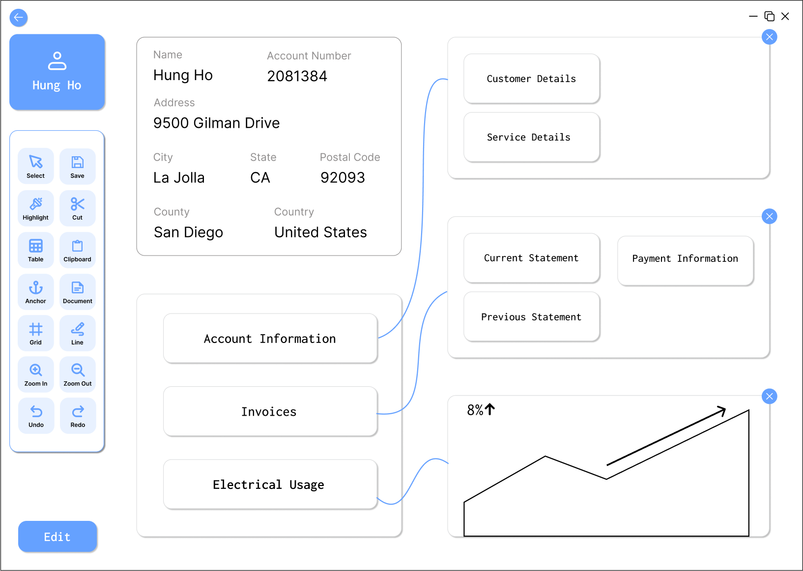
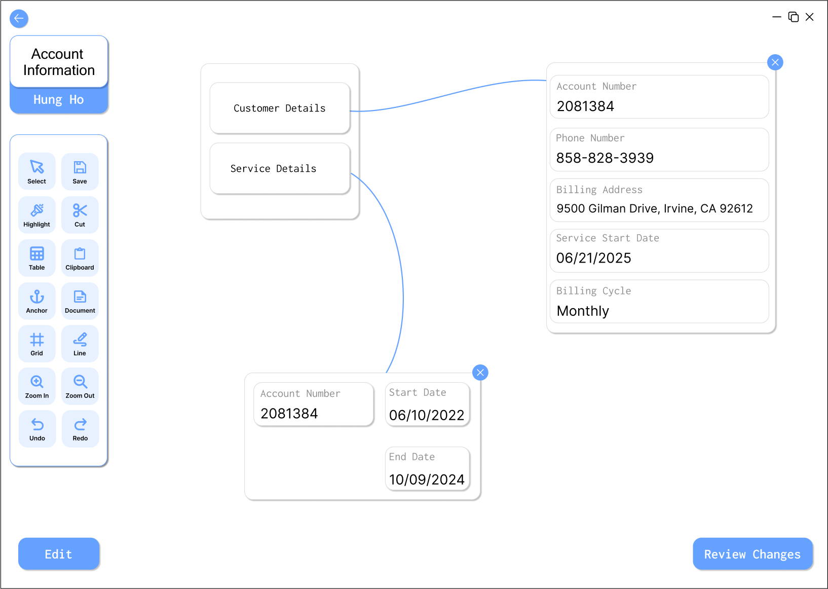
High-Fidelity Prototype
Our high-fidelity prototype focused on refining the node-based workspace concept while addressing the feedback received during user testing. We maintained a clean, intuitive layout while adding more customization options and clearer visual hierarchy.
Design Process in Figma
Using Figma as our primary design tool, we created a comprehensive high-fidelity prototype with interactive elements. This allowed us to simulate the actual user experience and test more detailed interactions before implementation.
Key Screens:
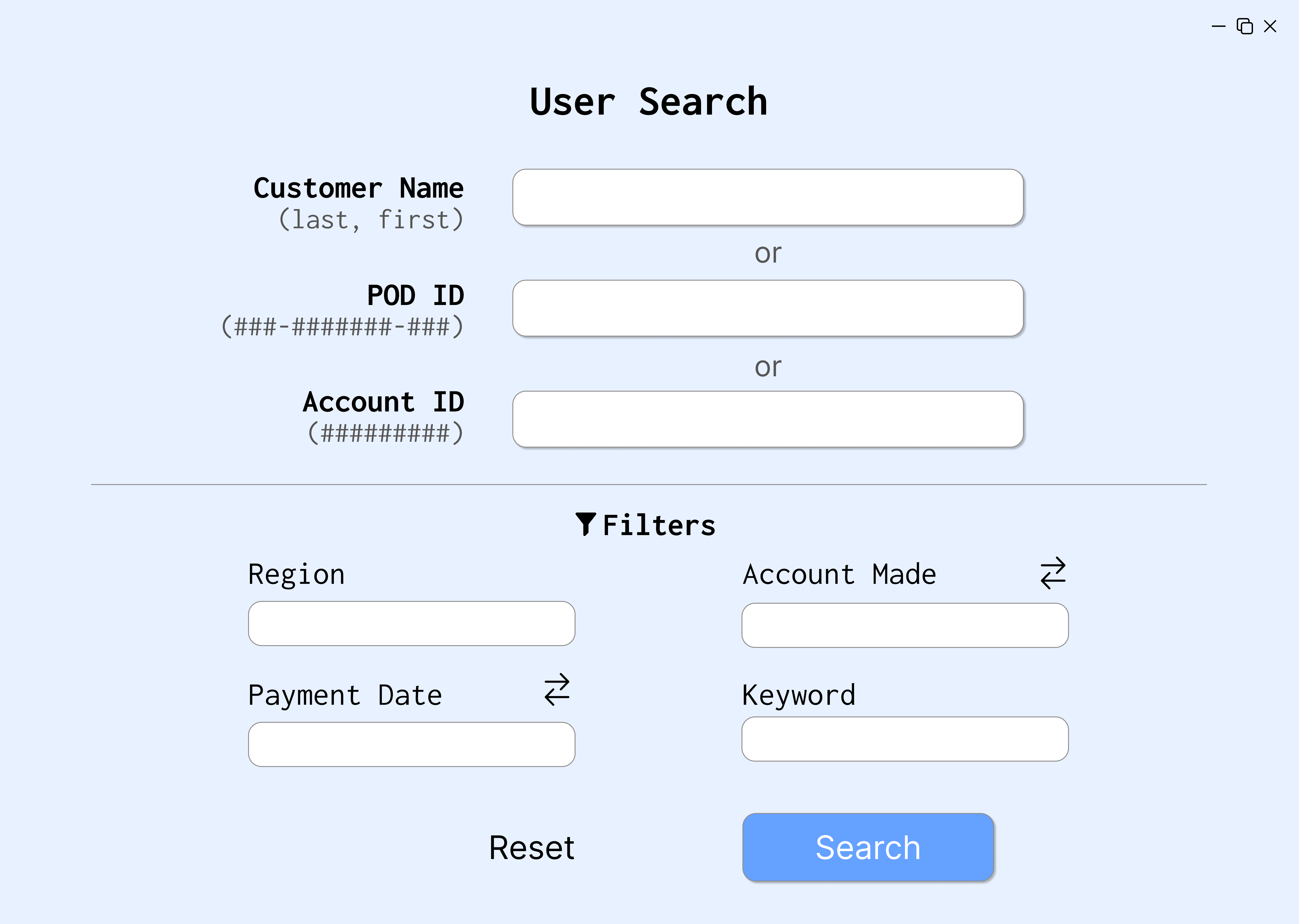
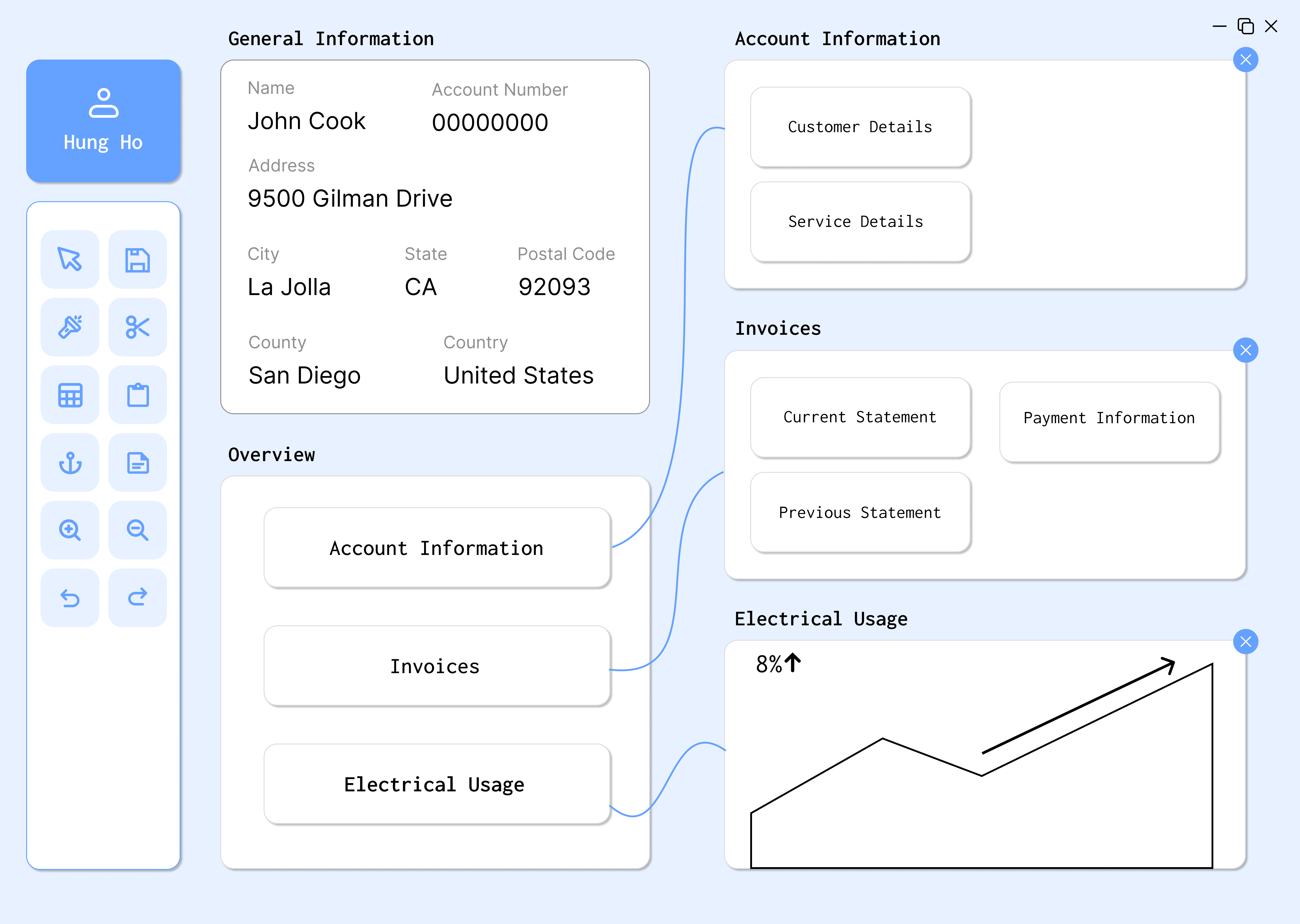

Design Decisions
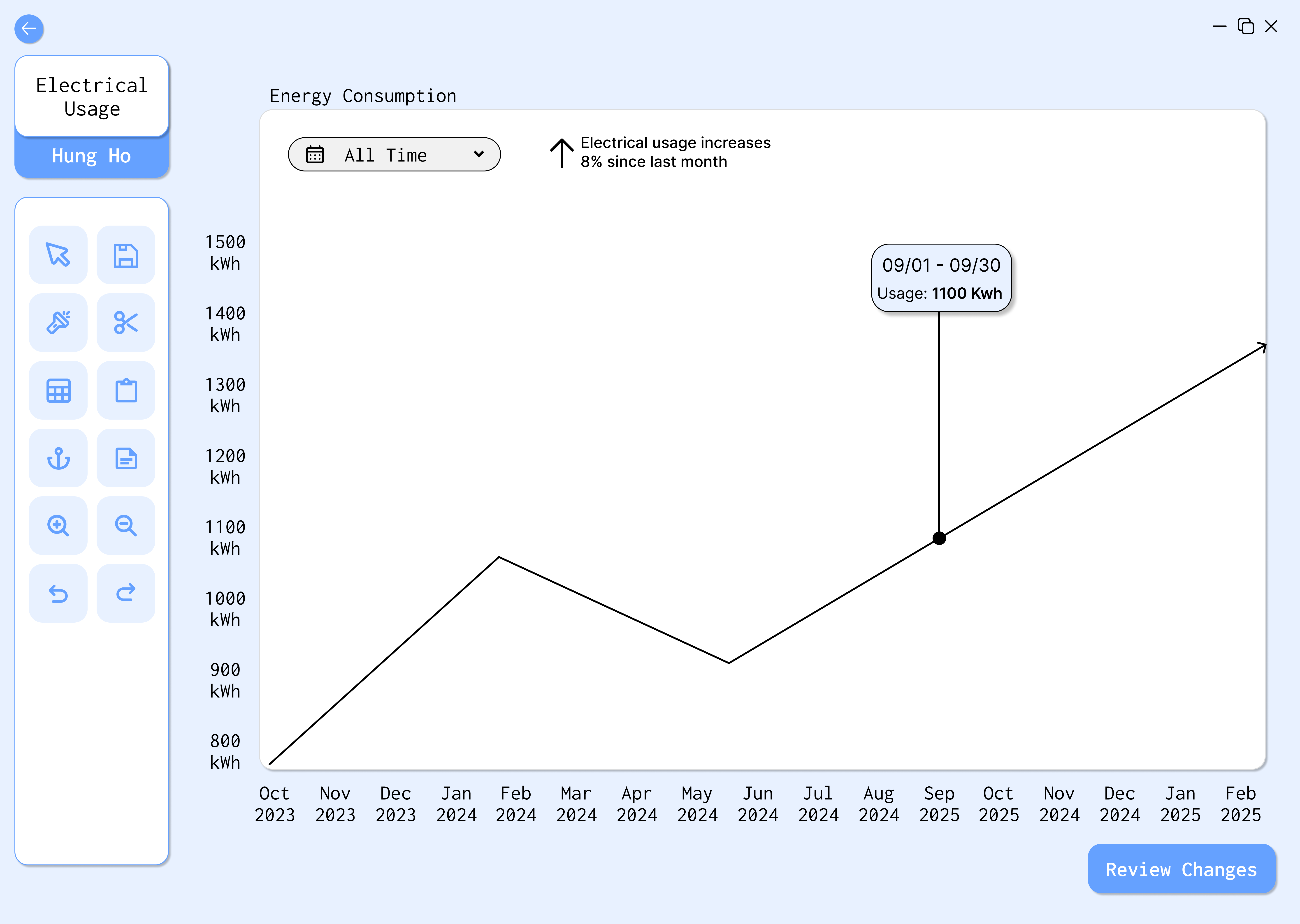
- Node-based organization: Allows for visual representation of relationships between data modules
- Advanced search functionality: Provides multiple entry points (customer name, ID, account number)
- Data visualization: Incorporates charts for electrical usage trends
- Customizable workspace: Users can arrange modules according to their workflow
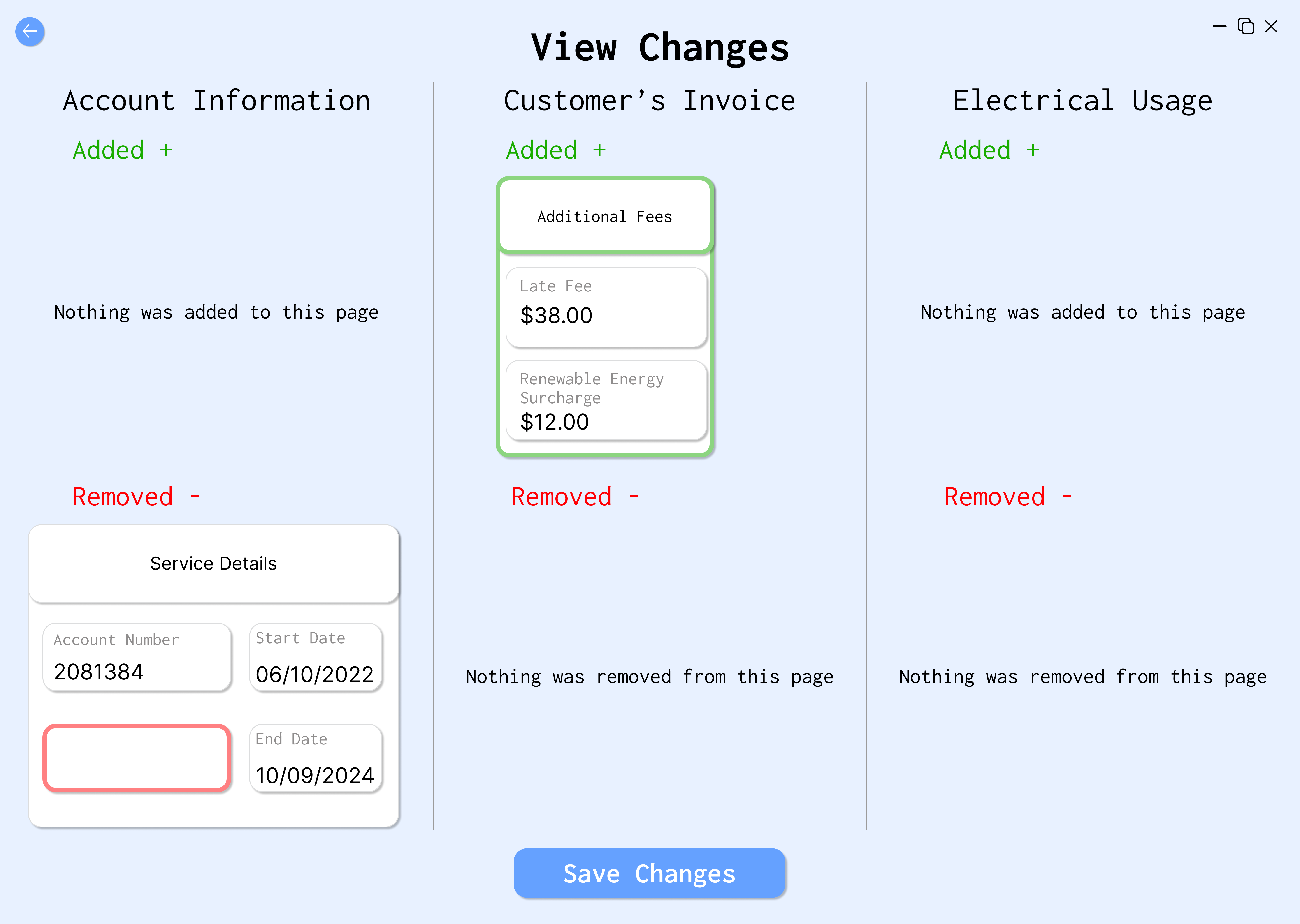
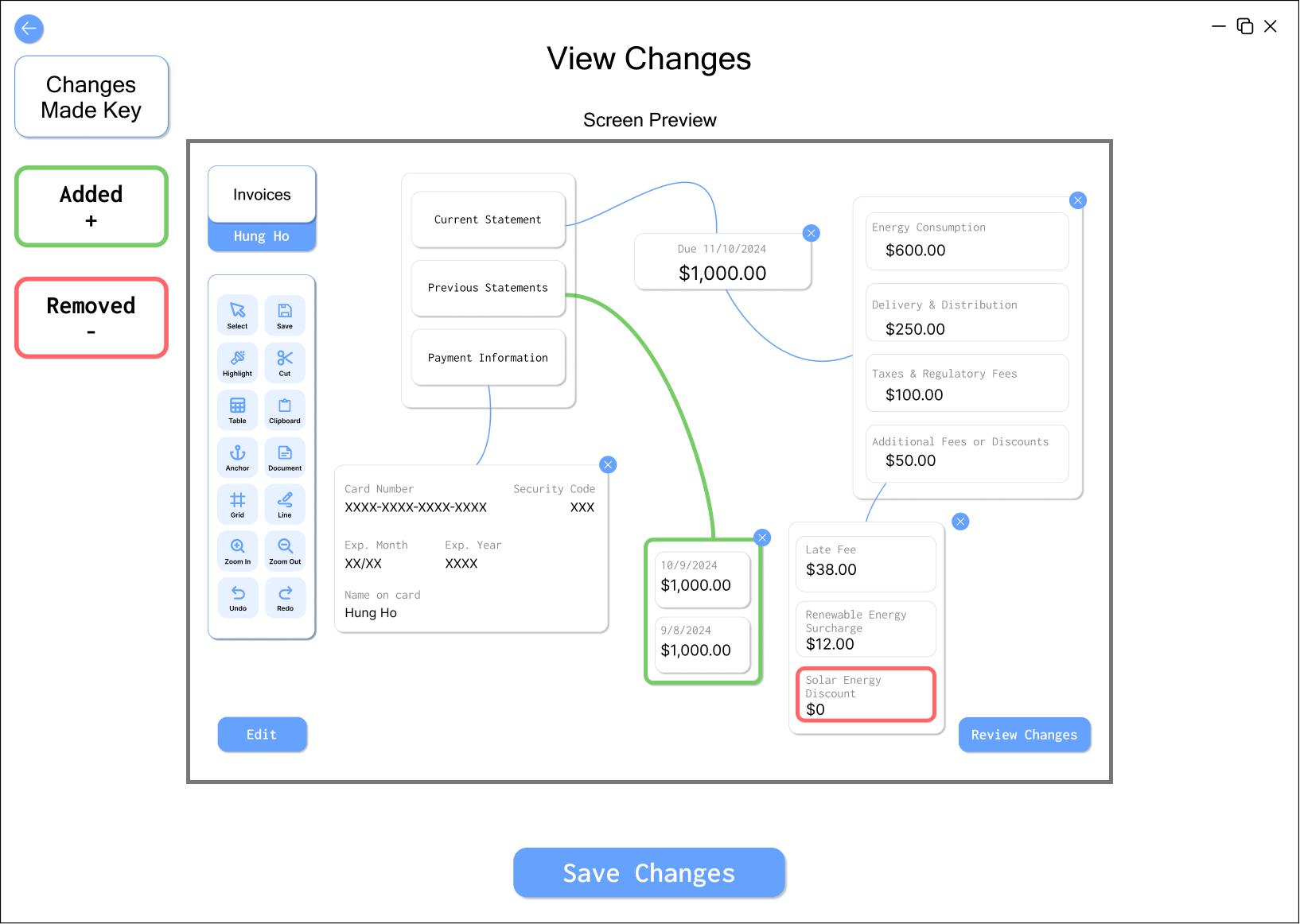
- Change confirmation: Clear view of changes before committing them
- Color scheme: Soft colors that are easy on the eyes for prolonged use
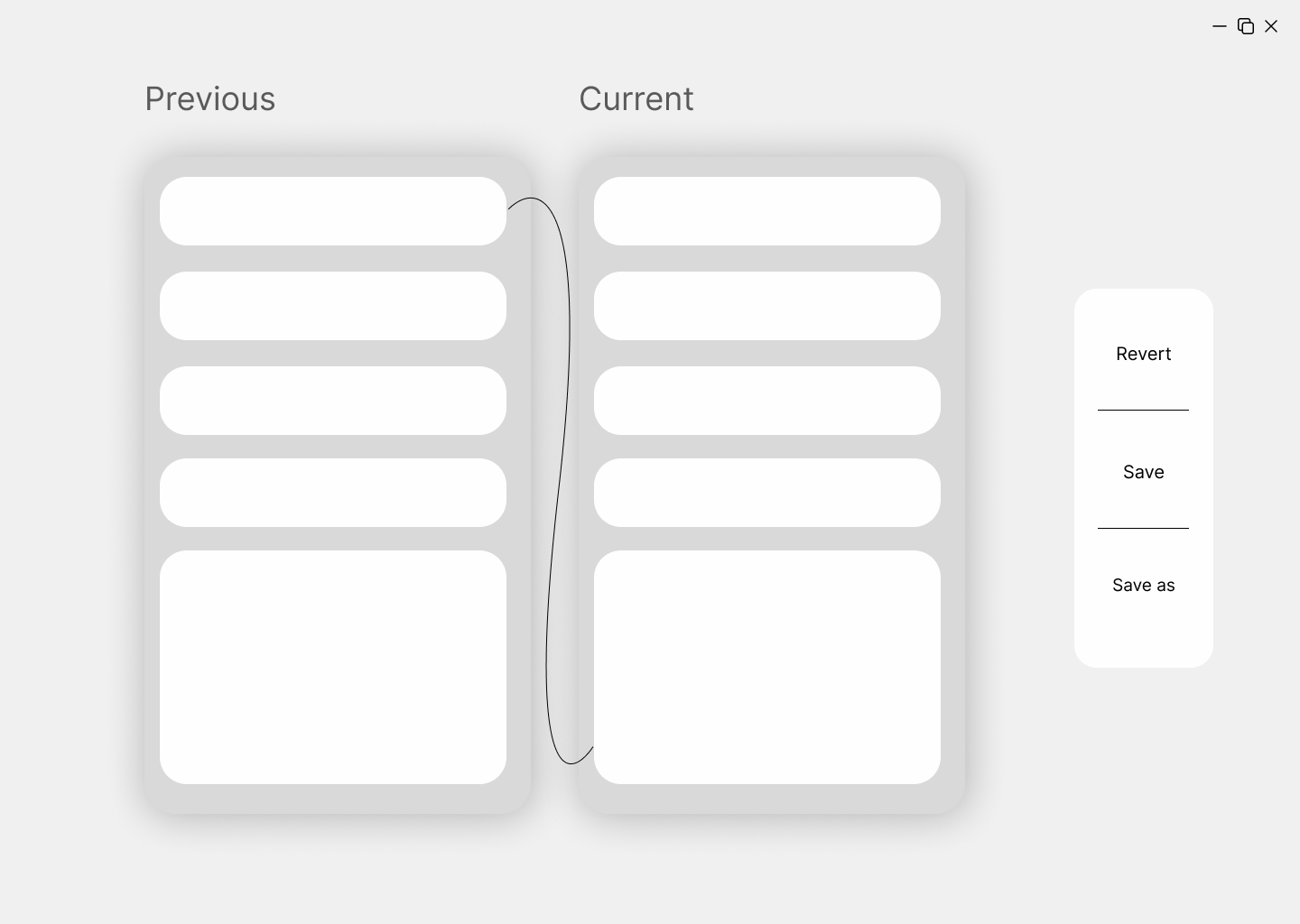
Final Refinements
Based on additional feedback from peers, TAs, and stakeholders, we made several key improvements to our high-fidelity prototype:

Key Improvements:
- Made connecting lines between modules more prominent for better visibility
- Removed redundant headings from sub-modules for a cleaner layout
- Added a grab tool feature for easier repositioning of modules
- Implemented a grid tool to help with alignment and organization
- Standardized fonts, padding, and shadows for better consistency
- Changed the workspace background to white for increased legibility
- Added green and red highlights to clearly indicate changes in the review page
- Added tool names under icons for better clarity
- Included an Edit button to prevent accidental edits
These refinements addressed the feedback we received and improved the overall usability and aesthetics of the interface.
Final Solution
Our redesigned Revenue Manager addresses the key pain points identified in our research while incorporating best practices from competitive products and feedback from user testing.
Key Features:
The final design creates a more efficient workflow by:
- Reducing the cognitive load required to navigate complex data
- Allowing users to customize their workspace based on task requirements
- Providing clear visual relationships between different information modules
- Simplifying the search process with multiple entry points
- Offering visualization tools to identify trends more easily
- Including safeguards to prevent accidental changes
Users can now complete their analysis tasks more efficiently, with fewer errors, and with a reduced learning curve for new team members.
Conclusion
This project demonstrated the importance of balancing innovation with user needs when redesigning complex interfaces. By taking a node-based approach to data organization, we were able to create a more intuitive, flexible workspace that adapted to users' workflows rather than forcing them into rigid structures.
The feedback from stakeholders was overwhelmingly positive, with particular appreciation for the balance between customization capabilities and structured organization. The redesigned interface not only addresses the immediate pain points but also creates a foundation for future enhancements as the system evolves.
This case study highlights how thoughtful UX/UI design can transform complex, technical tools into intuitive systems that enhance productivity and reduce frustration, ultimately creating a better experience for those who rely on these tools daily.
Project Team
This project was a collaborative effort by a team of dedicated designers who brought diverse perspectives and skills to the challenge.